Your nonprofit guide to mobile-first web design

According to statista.com’s latest numbers, over a third of the world’s web traffic last year came from mobile devices—a figure that has been growing exponentially since 2009. There’s no denying that mobile is the future, so it’s not surprising to see designers everywhere translating web content for tablets and smartphones.
However, many of these “mobile sites” end up being a frustration on both ends of the spectrum. Users often have to deal with less functional versions of their fully-featured desktop older brothers, and web designers have to figure out how to stuff the full site’s content into a tiny, pocket-sized screen. How do we get around this mess? If you’re a web designer, one of the best ways to get your site (and workflow) up to speed is to design using a “mobile-first” strategy. How can you accomplish this?
It’s all in the process
The concept behind this way of working comes from the steps used for transcribing web content onto different screen sizes. Historically, there have been 2 basic practices for this:
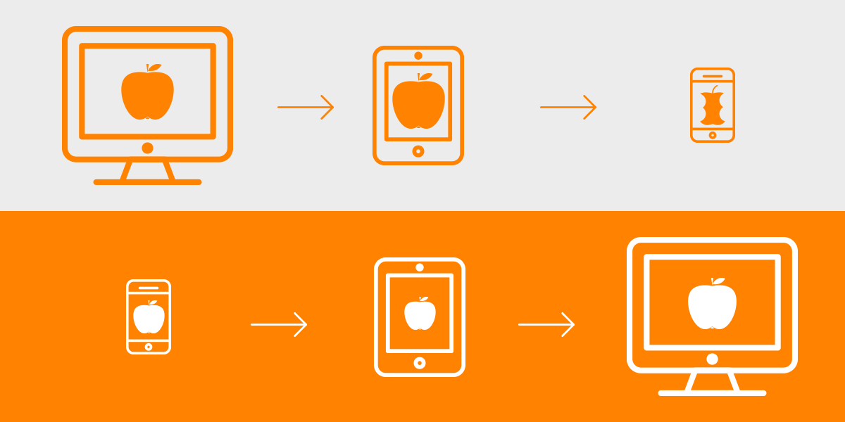
Graceful degradation: This is the process of taking content that is originally designed for a full desktop display and readjusting or reworking it for smaller screens. The problem with this method is that in order to make the site usable on a smartphone or tablet, designers often have to strip away elements and compromise on the site’s content and features. What we end up with is a site that feels like a cheap, incomplete version of the original.
Progressive enhancement: This is the previous method flipped on its head. Instead of sanding the site down to its bare bones, the design starts with the core elements at the smallest size and then progressively works its way up. The idea here is that it will lead the designer to answer the most difficult user experience (UX) problems first, making it easier to move to larger screens. If the site has a strong core foundation, designers can easily enhance and build on the site’s capabilities as it scales up to more powerful devices.
Content is king

The web is an endless buffet of information, and the meat and potatoes of any website is the text, images, and videos displayed on it. Generally speaking, the simpler the layout, the easier it is for the user to interact with the content.
The limitations of mobile screen sizes forces designers to prioritize the content, making mobile designs focus on what matters most. This extends to the larger sizes as well. If your site looks good on mobile, the same principles will apply to tablet and desktop—making for a cleaner, sharper looking result across the board.
Tips for best practice
Here are a few tips to get you started on your next mobile-first web design project:
Devise a sitemap
Having a game plan for your content will save you tons of headaches when designing for mobile and it is key in making sure the UX is buttery-smooth.
Create wireframes
Start off by establishing your main screen sizes, and then block out content in each one, going from smallest to largest. Remember to design each wireframe at the smallest standard screen width of each device to ensure that your layout looks good on the widest range of devices possible. Here’s a tool to help determine which sizes you should design for.
Enlarge touch areas
Keep in mind that tablets and smartphones are meant to be used with your fingers. Make sure smaller screen designs have large enough interaction areas to make browsing more comfortable and fun.
Employ “disposable” interaction effects
Don’t rely on hover effects and tooltips for vital information since these won’t really mean much on mobile. These interactions can be added in later on more powerful devices.
Use “scalable” images
Large, full-width photos have become a staple of modern web design, but make sure these images make sense when scaled down. For instance, a specific face or a landmark in a background photo might be too small or get cut off altogether on mobile.
Take ‘em for a test drive!
Most designers work off of desktops with huge displays, and this may distort our perceptions of size and function. If possible, it’s always a good idea to test your design on the actual devices you’re designing for.
Keep in mind, although mobile-first goes a long way towards streamlining responsive web design and workflow, it can sometimes result in over-simplification on larger, more powerful devices. Remember to consider the strengths and weaknesses of each platform, and you’ll have a site that’ll be as flexible as it is functional.