Making the most of your donation forms
Your emails look beautiful, your social media copy is engaging and your Google AdWords ads are snappy and ranked high. You’ve done everything possible to drive potential donors to your website. You may think the hard work is over—but if a donor lands on a dysfunctional, non-responsive or otherwise unwieldy donation page, all your hard work may be for naught.
Luckily, we have you covered. Below are six tips to help optimize your donation form.
-
Make sure your donation pages are mobile responsive
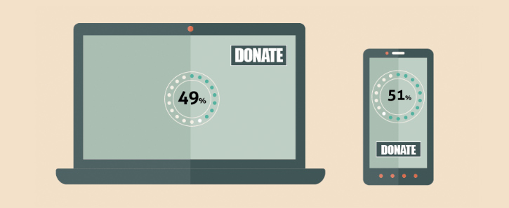 51% of people who visit your nonprofit website do so on a mobile device. That’s a lot of potential donors who may become frustrated if your donation form is non-responsive. Make sure your form is not only responsive, but also contains space and sans-serif fonts for easy reading. Additionally, make the process to donate as simple as possible for those potential donors on the go: require the bare minimum of information and use as few steps as possible to complete the transaction. (This holds true for desktop donors too!)
 -
Ensure your donation pages match your branding
Your donation pages should be in sync with your organization’s branding. This is an excellent opportunity to customize your donation form with fonts, colors and images that match your website. Instead of a generic ask, explain to a potential donor what their donation will contribute towards. For example, substitute the standard “Submit” on a transaction completion button, with a direct call to action, such as “Provide clean drinking water” or “Provide children with healthcare.” -
Experiment with pre-selecting a donation amount
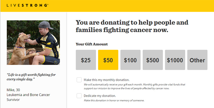 LIVESTRONG (above) is a great example of this idea. By providing donors with suggested gift amounts, you increase the likelihood that a donor will give more than if they were left to input an amount on their own. Pre-selecting an amount accomplishes the same goal. If you’re creating different donation forms for various segments, experiment by selecting different amounts based on the historical giving of each segment.
 -
Be sure to offer monthly giving as an option
And make sure that option is clear! You don’t want a donor thinking they’re making a $100 one-time gift when they’re actually donating monthly, and then asking for a refund on all of it. Data shows donors who decide to give monthly donate twice as much annually as those who make one-time gifts, so offering sustaining giving is a surefire way to increase donations. -
Let donors know their information is secure
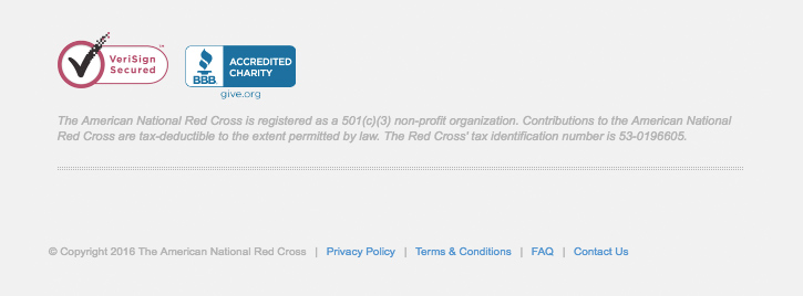 Donors like to know their financial information is being protected, whether they’re donating to charity or shopping online. Include simple logos for Verisign, the Better Business Bureau or other similar security measures. Provide a link to your organization’s privacy policy. These simple measures will build trust in potential donors. The American Red Cross uses both techniques (as shown above).
 -
Test everything!
Donation forms allow you a fantastic opportunity to test just about everything. Do donors of an animal organization respond better to a photo of a baby elephant or a pride of lions? Do donations increase if $50 is the pre-selected amount versus $25? Websites such as Optimizely make these sorts of tests easy to implement and monitor. Once the results have proven statistically significant, you’ve gained valuable information that can be applied across the board to your donation pages. Then, it’s on to the next test!
Did you find these tips helpful? Anything you think we missed? Tell us about them on Sanky’s Facebook and Twitter!