Responsive Web Design: Not Just a Buzzword
When you stuff the entire SankyNet staff into one conference room, great things happen.
Recently, the whole team gathered for an educational workshop organized by our Director of Technology, Matt Ryan, and Associate Creative Director, Regina Weick. The topic: responsive web design. This rapidly evolving development in web design is more than just a hot buzzword - it's a movement. We saw this first-hand through the recent success of our client, the African Wildlife Foundation (AWF), whose website redesign led to a dramatic increase in fundraising.
What is responsive web design?
Responsive web design is an answer to the problems that arise as internet use moves increasingly away from the desktop and towards mobile devices like phones and tablets.
Have you ever visited a website with great functionality on your desktop, but when you tried it on your mobile device, suddenly it wasn't so easy to navigate? That's where responsive design comes in; it adjusts to any screen size for the best functionality possible — no matter how you're visiting the site.
Responsive design is an umbrella term that encompasses responsive, adaptive and liquid design.
Adaptive design consists of defined layouts that depend on specific screen sizes or "breakpoints"— essentially a series of static designs Upside: Relatively quick and inexpensive to implement Downside: Can lead to awkward placement of content
Liquid design stretches or retracts the layout based on the size of the screen Upside: Maintains the order/layout of the original site on different screens Downside: If a window is particularly small or large, the content can be stretched or condensed too much, rendering it difficult to read and navigate
Responsive design is characterized by defined layouts for different screen resolutions. For each layout, the design is liquid, so it's really a series of liquid designs. Upside: Allows for optimal, responsive viewing no matter what device the user is using Downside: Can be expensive and time-consuming to create
In general, responsive web design enables the site to adjust to the best possible layout for a given device.
Why is this transition taking place?
Responsive yields better results. It's a cost-effective way to reach website visitors wherever they are, without having to create a separate site for mobile or jeopardizing the user experience. Content can be optimized to the platform rather than omitted simply for the sake of space.
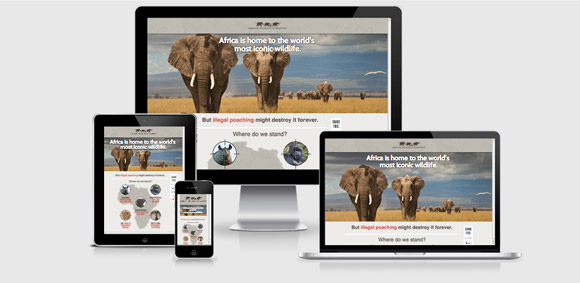
In the case of AWF, the original website was filled with a wealth of information and beautiful images — but clicking so many tiny sections and menu options was a challenge on mobile devices. This was especially true for the donation page, and a complicated mobile experience can easily be a missed donation.
The responsive upgrade utilized large, easy-to-touch images and icons, visual infographic-like storytelling and simple well-organized menus. The vertical, scroll-down design is effortless to navigate and visually appealing to any screen size. Best of all, making a donation is a piece of cake.
Give it a try!
Check out the successful AWF website redesign. Stretch the browser window to any size and watch as the content adjusts.
Visit http://liquidapsive.com/ and test out responsive, adaptive and liquid design for yourself.
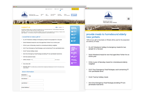
Here are a few of our own responsive web pages that have done wonders for our clients: