Introducing the new CovenantHouse.org on Drupal 8!
Hey there! Moriah Shtull and Yivan Zhong here to give you the low down on Sanky’s newest website redesign project. The new Covenant House website launched in mid-June and we think it looks pretty spiffy (if we do say so ourselves).
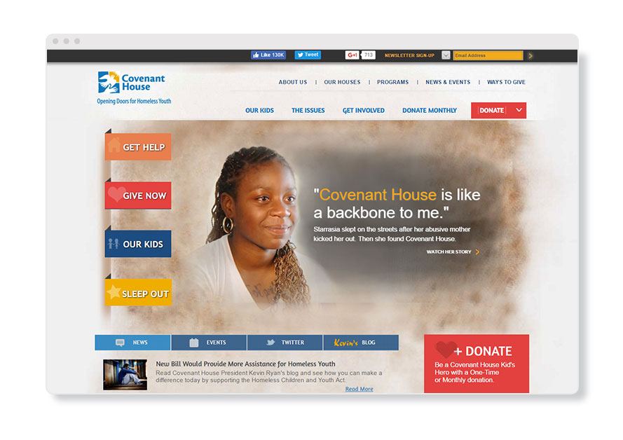
Just look at the difference in the homepages!
Before
After
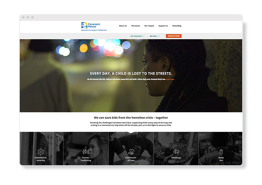
As you can see, the newly launched website (right) made vast improvements across the board — from form to functionality.
As the lead designer on this project, here are some of Yivan’s favorite things:
-
When we began designing, we made sure the Covenant House audience was kept in mind at all times. There were three main audiences we paid particular attention to: folks who want to support Covenant House’s mission through action (such as volunteering),those who want to lend their support through donations, and of course, youth looking to Covenant House for support themselves. We accommodate all three right at the top of page. The donation button also comes off the top navigation and becomes a fixed button that follows the user down the page, making it fundraising focused.
-
We had the most fun brainstorming and designing an engaging planned giving page, which prompts a user with a series of “quiz-style” questions. This interactive page gives a feeling of personalization by helping the donor find out quickly and efficiently what the best charitable giving plan is for them. The donor selects an answer, and the options most fitting for them pops right up. This format succinctly provides them with the information they need without immediately weighing them down with large chunks of text.
-
The dynamic checkout button on the gift catalog page is also an awesome feature for this site, replicating the feeling of a typical shopping page. But in this case, shoppers aren’t just shopping for themselves; they’re picking out life-saving items for homeless youth. We built this feature so that the cart total populates and updates automatically as items get added to the cart — creating a visually appealing, seamless experience.
As the digital project manager working on this project, here are some of Moriah’s favorite things:
-
Like Yivan mentioned, the website’s navigation has been expertly designed for user experience. We have the main menu in black at the top, but also a secondary row of “extra important” buttons too — both for visitors to get involved or for individuals to get help. Of course, we knew we’d need the donate button loud and proud. So when you hover over “get involved” or “get help” a tertiary menu appears with opportunities and a Google Maps feature. Covenant House has locations in 30 cities across the globe, making the drop-down feature with all of these locations a truly powerful resource. Last but not least, a hamburger navigation also appears once you scroll a bit down the page (and throughout on mobile and tablet), ensuring a visitor is always covered when it comes to navigating the site.
-
I also love the sitewide block displaying the number of kids who slept in a warm bed instead of on the streets each week at Covenant House. The scrolling numbers provides maximum impact!
-
Beyond their direct care services, Covenant House also does a lot of advocacy work and I think the new and improved pledge forms are really going to make a difference in these efforts. The number of advocates updates each time the form is submitted, as is the header copy, so that the number is always up to date — amplifying their caring community as it grows in real time.
What do you think about this new website? Share your thoughts with us on social media on our Twitter, Instagram and Facebook. Interested in learning more about our website redesign process? Reach out!