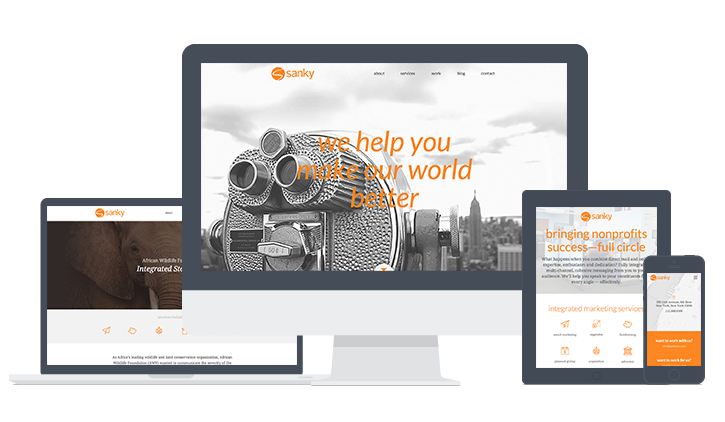
Our Summer Makeover
When our clients come to us and ask for a website upgrade or redesign, the reason is often the same: they're too busy doing their incredible work to create a website that truly reflects their organization and mission.
We're always ready to help. Working closely with our account teams on strategy, our creative and tech teams develop beautiful websites and microsites that truly reflect our client's ethos, work and personality.
Not too long ago, we realized that like many of the organizations we work with, we'd filled our time with doing work that really mattered – helping our clients achieve their goals – and as a result, our website was out of date.
We were chomping at the bit to start formulating the new look and feel, but before we started churning out mood boards, wireframes and copy documents, we asked ourselves some important questions:
- Who is visiting our site, and what does he or she want to see?
- How do we want people to think about our work, our mission and our agency as a whole?
- What's the best way to convey the personality of our office?
- How can we present our comprehensive offerings and expertise in a digestible, succinct way?
After discussing these questions and comparing answers, we got busy building the Sanky site of our dreams: fun, engaging, beautiful, simple, accessible, responsive and seamless.
We admit, we're a little in love with our summer makeover – and we hope you like it, too.
Want to talk to us about website updates? Whether it's a full-fledged redesign, a microsite or some small updates, we'd love to discuss. Get in touch!

