Optimizing donor experience: How to implement UX into fundraising
What is UX (or user experience design)? Taken at face value, UX can seem massive, costly and trendy. From established corporations to AngelList startups, everyone is doing it and doing it differently. But at the end of the day, the purpose of UX is to organize and label your content in a more understandable way so it’s easily accessible to everyone, regardless of age and digital literacy. This is crucial in fundraising, especially considering most nonprofits promote a cause or a set of values—not necessarily a physical product. A smart UX strategy can keep the user or visitor motivated all the way through, eventually securing them as a donor.
UX can help your nonprofit understand prospect donors better and potentially increase conversion rates. And while not all methods will be applicable to your organization, here is a list of UX approaches we’ve pulled together to help you get started.
Research methods
-
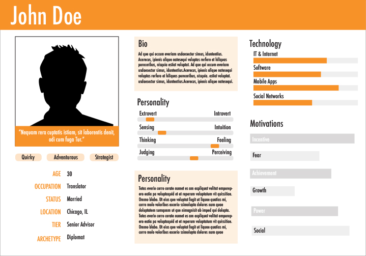
Personas
 As Tom Kelley from IDEO puts it, “Personas are based on real data and users, gathered through research interviews and observations.” With all the existing data available these days, it can be super useful for organizations to group known details about their audience into a comprehensible set of descriptions—or personas—such as age, gender, location, motivations and needs.
 -
Stakeholder interviews
Stakeholder input is particularly important for the UX team in gathering organizational insights, needs and goals that might not have been previously stated at the launch of a given project. Asking your stakeholders directly can be key in avoiding a lot of unnecessary guesswork.
Concepting methods
-
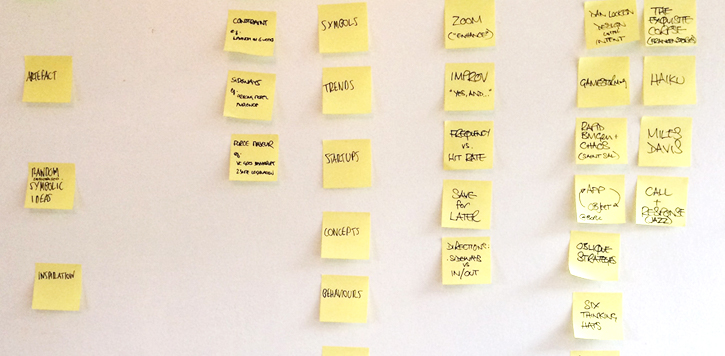
Card sorting
 No matter how you segment your audience in emails or social media channels, they all land on the same website or page. A good sitemap is the foundation of any website redesign, and card sorting is one useful way to help build that foundation. In card sorting, the UX team will identify key features for a design project and place each item on a post-it or index card. Then, they will ask participants to arrange those cards into a logical treemap structure. After that, the team will compare the results and determine the taxonomy of each group. This makes organizing your content feel less like a headache and more like a fun activity (we hope). In addition, the participants could be the donor, the client, the designer or even kids!
 -
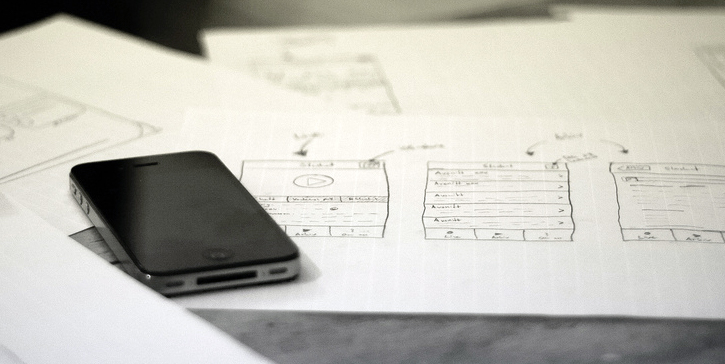
Storyboards
 "A picture is worth a thousand words," as the old saying goes. Storyboards are a set of illustrations that show how an end-user might interact with the digital product you are creating. The power of this visual approach not only helps designers pinpoint where problems might arise, but also clarifies their solutions in a more simple, clear-cut way.
Validation methods
-
Usability test
As fundraising professionals, we test our websites, forms and emails hundreds of times across nearly all browsers and devices. We know the design and functions by heart. But we are not the user or first-time visitor. Having someone external to play with your prototypes and complete several easy tasks will provide your nonprofit with a fresh perspective on things. A usability test gives your organization the chance to observe audience behavior up close and personal, taking research to a more ethnographic level. -
A/B testing
Running Optimizely A/B testing has become more and more popular among nonprofits, whether it’s testing out images, copy, typographies, layouts and more. This method is almost effortless to set up and can save your nonprofit a lot of wasted time from debating back and forth on such things. However, since this method is completely quantitative, campaigns that naturally garner higher traffic are more likely to benefit from the results—such as year-end or holiday campaigns.
As I mentioned before, every company does UX based on their own needs and business goals; every project has a different timeline and scope. No matter which method you choose to implement, it’s always good to pause for a minute and think, “What value will this bring to the donors?”
Did you find these tips helpful? Anything you think we missed? Tell us about them on Sanky’s Facebook and Twitter!
