Best practices: donation forms
Sanky Communications has provided specialized online communications and digital media services to the nonprofit world for 18 years! Based on our tests and experience over nearly 2 decades, we are happy to provide some core recommendations.
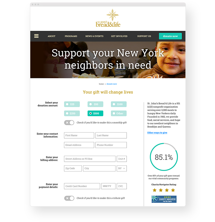
Form needs and layout vary significantly from platform to platform (and organization to organization!) — but here are some key tips to keep in mind:
-
Maintain an overall clean and simple look and feel
-
Avoid any top navigation except for your logo
-
Use a mobile-first layout so it is as easy as possible to donate on mobile devices and tablets since this is a rapidly growing portion of those who give
-
Ensure a one-step process for your donors
-
Place form fields as high above the fold as possible
-
Include one highly compelling image that can be swapped as needed
-
Use as few form fields as absolutely necessary, with optional hidden fields to be revealed with a check box (namely memorial/tribute giving)
-
For any one-time giving forms, have one-time giving as the default but also include a visual way to emphasize sustainer giving as an option to provide ongoing support
-
Provide minimal copy above the form that speaks to need, impact and tax-deductibility of giving
-
Make sure there's an area of the page that underscores fiscal responsibility (third party icons, impact metric, etc.) to reassure donors
-
Display minimal footer links including privacy policy, tax ID and other key information
-
Follow up with engaging confirmation pages and emails that include required tax information as well as reminders about employer matching gifts, etc.
Use this list as a checklist to evaluate your existing donation forms. Does it make the cut?
Interested in learning about how Sanky can help optimize your website for higher contributions and engagement? Reach out to us!
