Man Versus Machine: African Wildlife Foundation Spring Campaign

At Sanky, we spend a lot of time discussing what makes great creative. Is it inspired strategy? Is it clever copy? Is it beautiful design? All of those things are necessary building blocks for great creative, but more important than all of that is that it is made by us. Great creative is great because it is made by people. For our clients, their work is personal, which means our work needs to be personal too. But what happens when you take humanity out of creative? What would a fundraising campaign created by AIs look like? We’re about to find out.
I recently received an ad for Jasper, a copywriting AI, and I’ve decided to take it for a test drive by recreating a deliverable from the recent spring campaign we did for African Wildlife Foundation (AWF). In addition to Jasper, I’ll be using Designs.ai and DALL-E Mini to help with the design half of the campaign. It’s time for some good old-fashioned Man vs. Machine fun.
AWF Spring Campaign
For the AWF Integrated Spring Campaign, we were tasked with leveraging the success of last October’s 60th Anniversary campaign to reintroduce a successful legacy campaign, “Only Elephants Should Wear Ivory,” which ran in print between 1989 and 1992. Not only were we reintroducing the campaign, but we were also putting a new face to it with actress and advocate, Candice Bergen, serving as both the signer and match donor. We had a match goal of $50,000.
This was an especially large and ambitious campaign that integrated DM and digital, and at times, there were up to five different audiences that deliverables needed to be versioned for, including a UK audience. Today, we’ll only be talking about one deliverable, though: the landing page.
The Landing Page
The landing page was designed to be an updated and modernized take on the legacy campaign. The primary goal was education and cultivation around AWF’s work — past, present, and future — although there was an exit modal and a small area on the landing page itself that promoted the match and linked to the donation form.
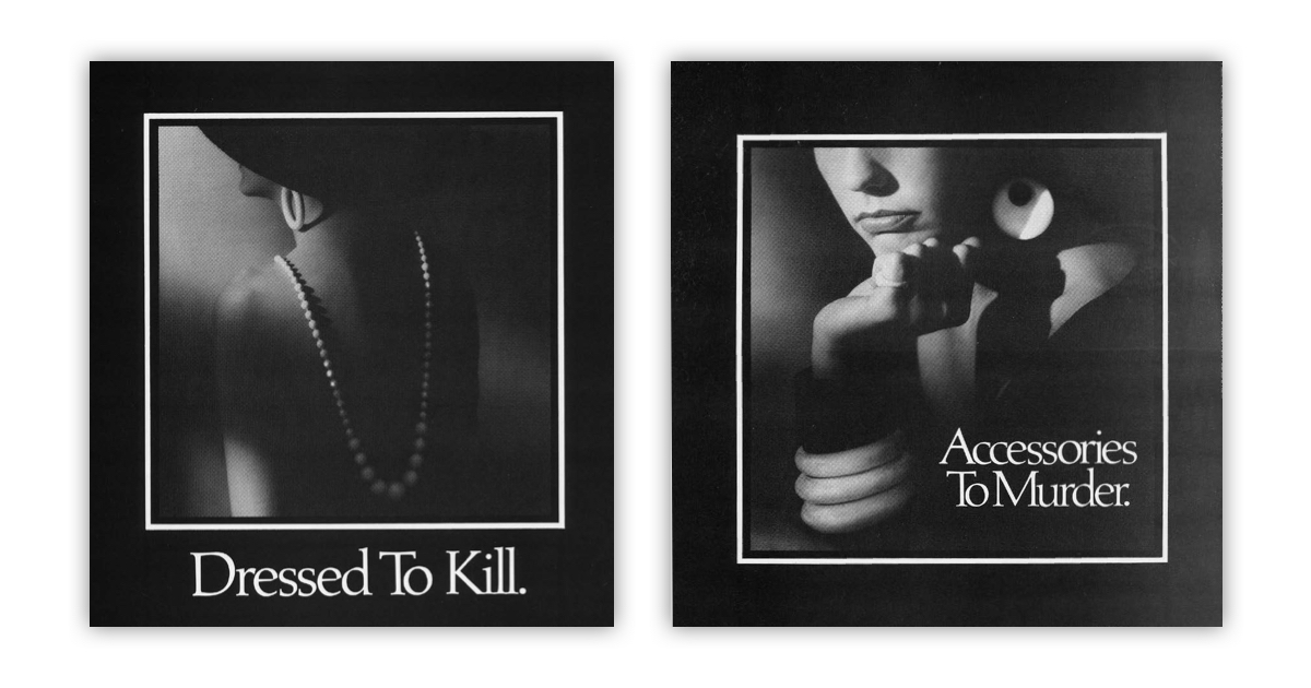
A key part in making this landing page a success was acknowledging what was so successful about the original “Only Elephants Should Wear Ivory” campaign. Senior copywriter Alexis Sachdev explains, “Forty years ago, AWF ran a series of cheeky, in-your-face ads that challenged the way shoppers viewed ivory and the impact this ‘trend’ was having on wildlife. Seeing ivory come back into vogue, but now in relics and decor rather than jewelry and luxury items, AWF wanted to bring back the sort of chutzpah they showed in the 80s. Our creative team got to work brainstorming some taglines in the same vein as the ads from the 80s — a bit cheeky and in-your-face, and centering the elephant’s experience in this business.”

Chutzpah, indeed. The original ads pack quite the punch. In three words, they decry the importance of material objects over life. And really, it’s just incredibly impressive wordplay. They make elegance feel savage. Our modern copy takes on that same tone but sets up a “them” vs. “us,” and later a “them” vs. “you,” dynamic that invites the reader into the fight. There’s a formula of “they said, they said, they said. We verbed, we verbed, we verbed,” and for every “you can’t do this,” there is a more powerful “we already did.”
In terms of design, the original print ads feel timeless, but what does a 2022 version of timelessness look like? We live in a scrolling age, where we consume content quickly but not always intently. This landing page was designed for scrolling, but it paces you and offers you the chance to really consume the information. The images and text fill your screen so you’re not able to see all the information at once, and as you scroll through, animations perform an emotional gut-punch.
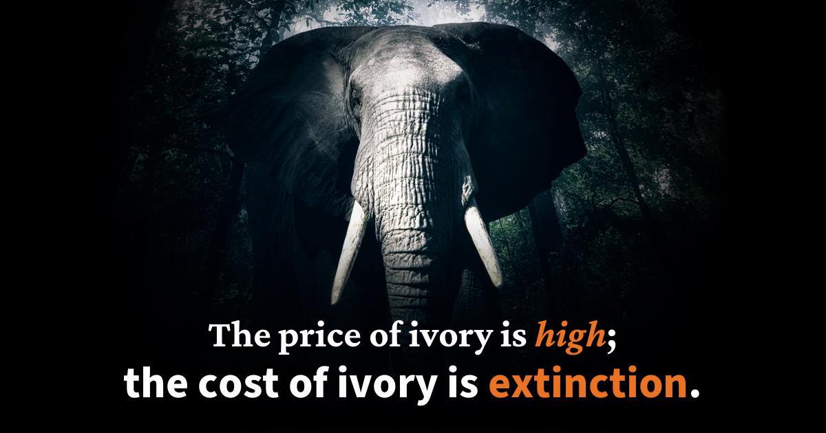
A third of the way through the page, you land on a full screen image of an elephant, who looks you right in the eye. As you keep scrolling, the image stays where it is and the words “The price of ivory is high; the cost of ivory is extinction.” slowly appear as the color drains from the photo of the elephant. For a second, you’re left on that full screen image, with just the elephant’s ivory tusks fully visible, letting the copy really sink in. That moment and that scrolling experience are what make the landing page feel as timeless as the original print ads. It is very 2022 to call something “iconic” that by all definitions technically isn’t, but hopefully in forty more years, this landing page will exist as an iconic relic of continued success — and not as a legacy campaign that once again needs revival.
The AI
And now we get to the experiment. I have to say, I wasn’t expecting much from these AIs, and yet, they somehow managed to do an even worse job than I expected. I set some rules for myself at the beginning of this experiment. Namely, I could not add my own creative spin to anything created. I also was not going to attempt to exactly recreate the landing page made by the Sanky team; I wanted to see how these AIs would interpret the same information we had.
In terms of process, I followed the path that we use most often at Sanky, that also made the most sense to me as a writer. I would start with Jasper, the copywriting AI, and use that copy to inform the design. For layout, I would be using Designs.ai, which says it uses “AI technology to allow users to create, edit, and scale content.” For image sourcing, I would use DALL-E Mini, an AI image generator.
Jasper allows you to write copy for a lot of different types of deliverables from social posts to SEM to blog posts (note: this blog is not written by Jasper) to, you guessed it, websites. Or so it claims. When actually using the site, there wasn’t an option to have it write a full landing page. Instead, you could have it write paragraphs and headlines and subheaders all as separate things, but doing that seemed like it would require a level of ideation that would break my first rule of minding my own creative business. Luckily, Jasper also lets you give it commands, which is what I decided was my best bet at getting as close to a whole landing page in one go as possible.
My plan was to prompt Jasper with information from the brief but Jasper has an 800-character limit on prompts, so even the overview section of the brief was too much. I was able to shorten it down to just the baseline details. Here is the prompt I gave Jasper:
Write a landing page for African Wildlife Foundation, reintroducing their “Only Elephants Should Wear Ivory” campaign with Candice Bergen as the spokesperson and $50,000 match donor. Briefly highlight the 4 themes of African Leadership, Landscape Conservation, Community Benefit, and Species Protection – focusing on Species Protection. More specifically, focus on combating threats at every stage of wildlife trafficking, from deterring poaching to anti-trafficking through contraband detection and strengthening prosecutorial capacity to reducing demand in target countries. This strategy has been AWF's focus for 60-years, and with the donors' partnership, they won't stop until only elephants wear ivory.
Using that prompt and some basic background on poaching (which was also limited to 800 characters), I had Jasper come up with three copy options. And then I broke my golden rule.
None of the options felt like they fully covered that prompt, and so I combined them into one body of copy that I felt at least hit closer to the mark. To remain at least somewhat ethical in this experiment, I kept the amalgamated copy to about the same length as each individual generation. Here is the amalgamated copy:
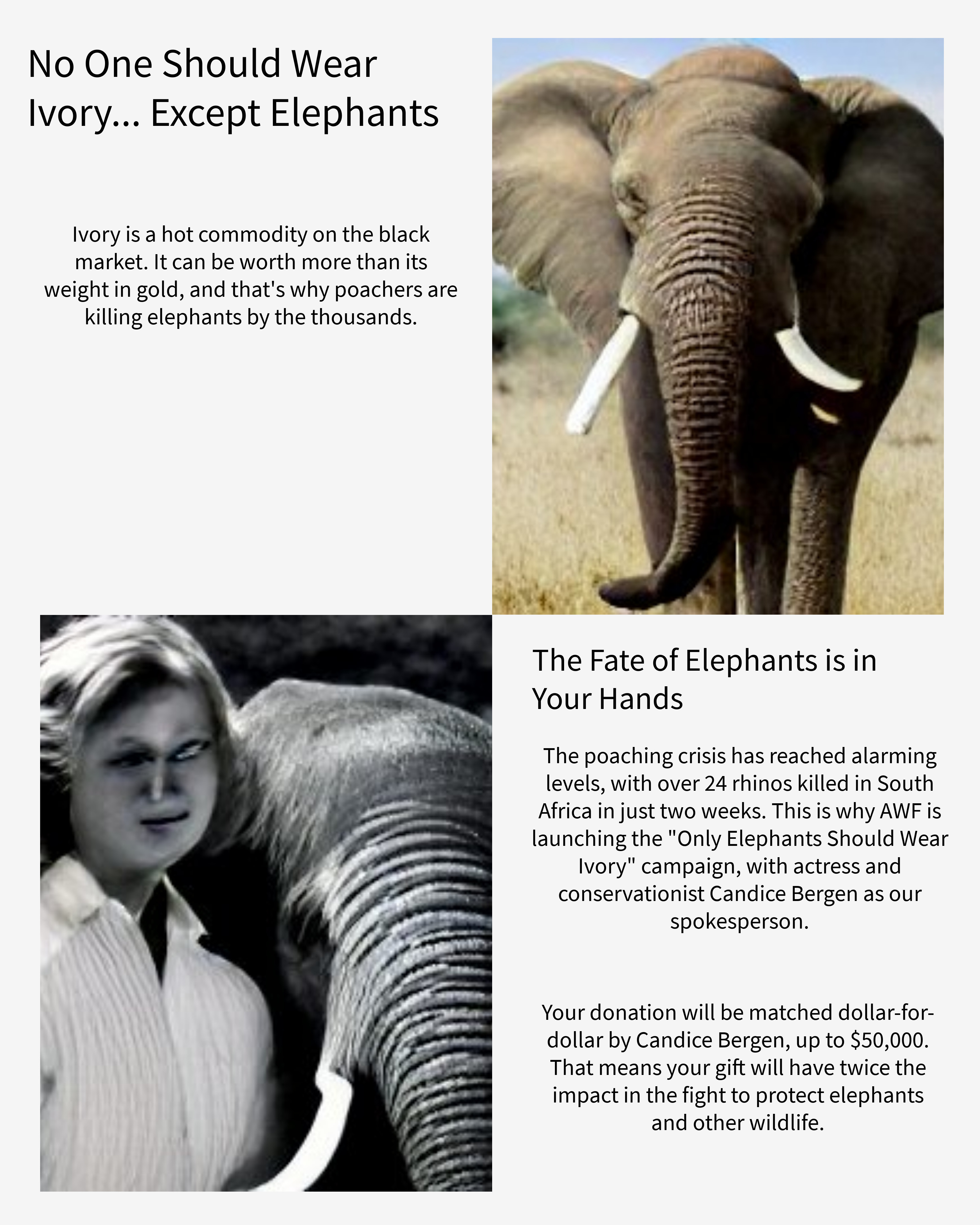
Ivory is a hot commodity on the black market. It can be worth more than its weight in gold, and that's why poachers are killing elephants by the thousands.
The poaching crisis has reached alarming levels, with over 24 rhinos killed in South Africa in just two weeks. This is why AWF is launching the “Only Elephants Should Wear Ivory” campaign, with actress and conservationist Candice Bergen as our spokesperson.
Your donation will be matched dollar-for-dollar by Candice Bergen, up to $50,000. That means your gift will have twice the impact in the fight to protect elephants and other wildlife.
Once I had copy that I could use for the body of the landing page, I had Jasper generate three headlines using the same prompt. I selected two of the three to use:
No one should wear ivory… except elephants
The fate of elephants is in your hands
Overall, the Jasper experience was fine. The sentences it created all felt robotic — which I guess should be expected from copy written by a robot — and I would never use it to come up with actual landing page copy, but it didn’t have the grammatical errors I expected it to have. Its biggest fault is how limited the character count is for prompting it and providing background. If you could add more than 800 characters of background, I think it would be able to do a slightly better and more nuanced job. Although maybe not. The statistic it chose to use from the background wasn’t super relevant to the campaign at large.
With copy done, it was time to move into layout and image selection. Designs.ai has a ton of templates for what seems like endless types of deliverables. Unfortunately, they don’t have anything specific to websites, so I chose a random one of their basic blank templates. It was once again hard not to break my own rule about not infusing this project with my own creative opinions, but after my rule breaking with the copy, I was committed to letting these AIs survive on their own merit.
And then, it turned out I couldn’t use Designs.ai without doing at least a little bit of the work. As far as I could tell, the AI part of it was just that it would automatically resize images to fit whatever box they were in. Otherwise, everything else is really up to the user, and so I decided the most fair thing to do for the experiment was the bare minimum. I put the copy in areas where it seemed to sort of make sense, but I didn’t try to align everything perfectly or fill the space perfectly. I didn’t change the font or even the sizing. I didn't change any colors or add anything to the background. Those were all things I could have done, but this experiment isn’t about what I can do.
When it came to image selection, I used DALL-E Mini, which generates nine images based on a prompt. I knew DALL-E Mini would require me to have a relatively short prompt, like Jasper, so I couldn’t just paste part of the brief in there. Instead, I asked senior design Luis Cepeda how he approaches image selection. He said, “The most important things I look for are: 1. Subject matter 2. Composition and 3. Emotional Resonance. First and foremost, the image needs to be a visual representation of what is being discussed or conveyed, and that can be literal, conceptual, or anywhere in between.”
I gave DALL-E Mini two prompts. The first of which was the first headline I had generated on Jasper, “No one should wear ivory… except elephants.” The second was “Candice Bergen elephant.” Doing this meant I had one image that was literal and one that was more conceptual. I could have followed through with his advice more and then chosen the options from each prompt that had the best composition and emotional resonance, but instead I chose to do the bare minimum again and used the first option generated for each prompt. The final step was adding those images to the Designs.ai template, which was super easy and the automatic resizing worked really well.
Before you see the final product created by these AIs, I feel it’s pertinent that I give you a warning. You are about to see a terrifying image that one member of the creative team called “a zombie person” and another member simply said “the horror.” This is supposed to be an image of Candice Bergen, but because it is AI-generated, it’s hard to even call it an image of a person, and I would personally like to apologize to all of you reading this and to Candice Bergen herself. I truly feel like Frankenstein. Without further ado, please meet my monster.
 DALL-E Mini didn’t do Candice Bergen justice.
Final Thoughts
For decades, there has been this fear that robots will revolt and take over. Luckily, if this experiment taught me anything, it’s that copywriters and designers will be spared during the Robot Revolution. There’s a level of ideation that AIs are not currently capable of. All of these AIs could do very basic work, but none of them were really thinking through what they were doing, not the way people do. They lack the emotional intelligence that humans have, which is key when it comes to the work we do. Creative is nothing without emotion. We don’t just create campaigns for our clients; we’re in the fight with them.
And we’re proud of our creative. It’s not just our work; it’s our craft. We are fundraisers, problem solvers, storytellers, artists, award winners. We are the people behind your next great campaign. If you’re interested in discovering what the future of fundraising looks like for your organization, reach out to us about our creative and strategic services.
Like what you read? Check out this related post:
